Size up a stock with live data
Ask a real question — “how’s this stock doing, and what do you make of it?” — and Vancetope does the whole thing in one message: it recognises it needs live data, spawns a research worker to pull the figures off the web, draws them as a native chart, and writes an assessment that cites the data it’s standing on.
We asked it about Apple’s last ten years. It fetched the yearly prices, rendered a candlestick chart (honestly noting the current year is incomplete), and then gave a verdict with its reasons on the table — the 12.5× decade, only two down years, the slowing pace, the ~30–33× valuation.
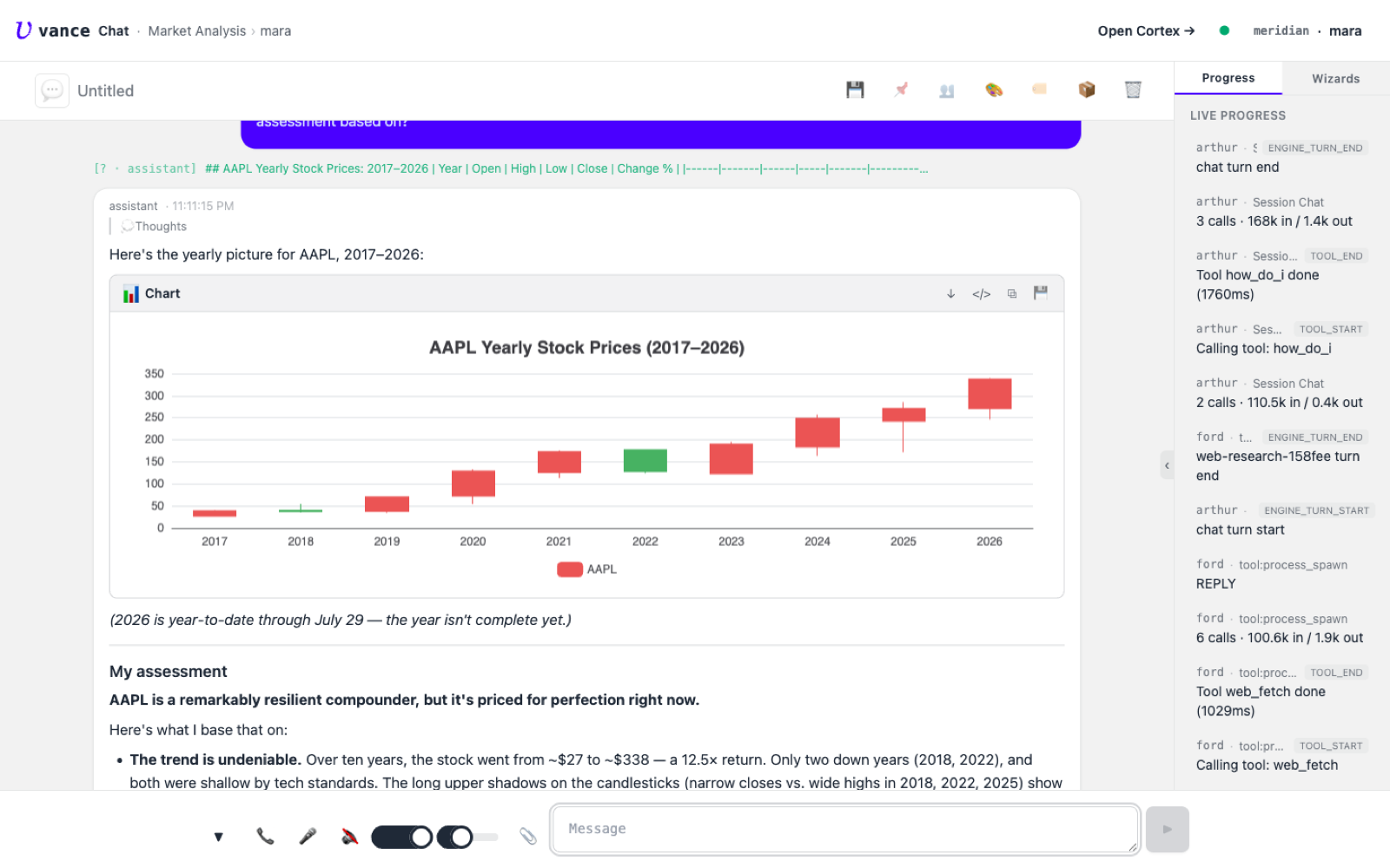
That’s the difference from a chatbot answer: real data it looked up itself, a chart that’s a real editable document, and a view you can argue with because the reasons are shown.